project in practice
In this section, the creative development and experimentation is portrayed, along with reflection on the ways the project has been explored, as well as experience with printing. It represents the different versions and practical methods the project has been through and what has been learned from it. Please click on the images to zoom in or use the arrows on the sides to scroll through.


The slides on the right are my initial notes from the start of the course, back when we were still deciding on a subject and a format. I considered things like fashion apps, sociopathy apps (don't know what that was about), talking about my country's wine etc. These were all either already done or not very 'flavourful'.
However, when told in class to choose a topic we are passionate about, the only thing I could think of was my country. So after this, I started to only think how I could incorporate this into my project in an engaging way. I started thinking if there are other people like me: living away from their home country but that still love and miss it every day. I found out that there are! Every migrant thinks and dreams about their home, no matter how 'corrupt' or 'poor' their country can be, it's home. After a few more class exercises, the idea was born.
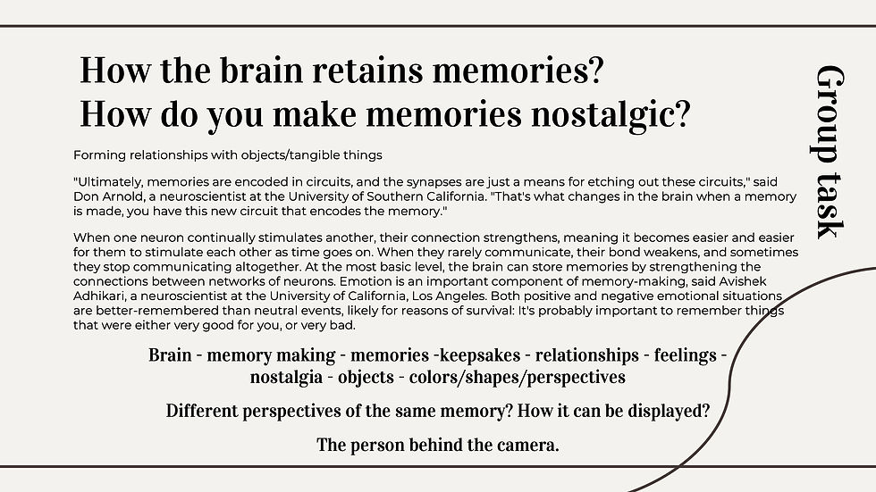


On the left, is our idea generation process and thoughts throughout this project.
Our initial idea was to focus on our cultures, to celebrate them and use the symbols and traditions from each culture: Moldovan and Indian. We were unsure how we would do that yet, as it was the first presentation. However, we knew we wanted to celebrate cultures of migrants and show that they forever stay with us even after moving away.
After brainstorming and asking each other questions, we thought of our initial idea. Showing how home is something that can be inherited through generations, and never leaves one's memories.
The memories of a home that is not the house or the country you live in, is a confusing state someone can be in. Dreaming of a place you have never been, or that you barely remember makes one feel like they are missing something, like a part of them is still there, hidden somewhere but with no instructions how to find it. This can happen to direct and inherited migrants, whose whole lives are split between ‘here’ and ‘there’. How is your identity shaped when half of your heart is somewhere else? Is the illusion of what could be out there enough to keep you satisfied, or is your curiosity leaving an open wound that worsens as time passes?
This is a topic of interest to us due to me being a direct migrant and Nikeeta having inherited her culture from her parents and grandparents, who moved away from India before she was born.


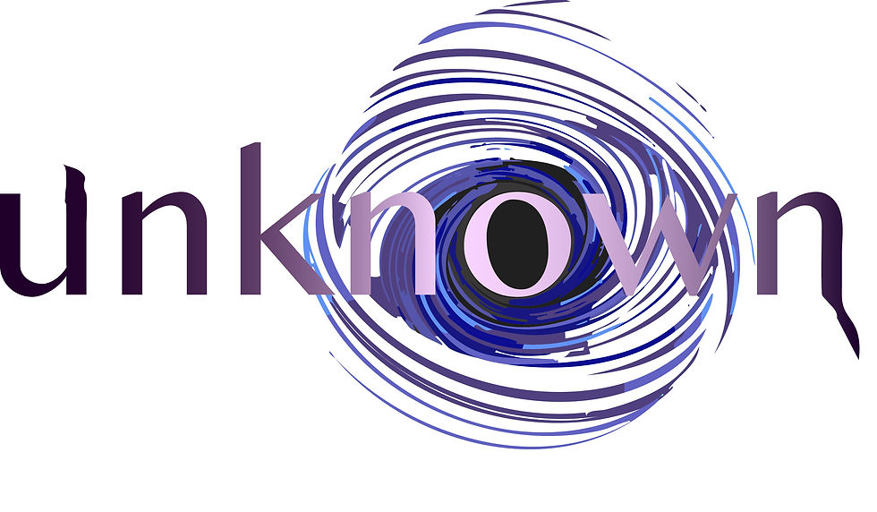


During this class we were asked to use Photoshop to edit a potential title of our project, and include an icon within the logo. Back then, both me and my creative partner had no idea how our project will look like visually, although we had ideas of the routes we planned to take.
We both wanted the zine to be different visually. We wanted to incorporate contrasting symbols and interesting visual motifs. I choose to go for a darker route, with a more ambiguous name and icon. On the other side, her edit was bright and playful. This helped us understand what aesthetic we wanted to go for, and with the indicative creative outputs. Mine is presented on the 3rd picture, a mixture of travelling symbols - all very familiar for a migrant. I wanted the edit to feel bittersweet, just like moving away from home is.

For our crits presentation, initially the aim was to prepare one zine draft, like the one seen on the right. However, we were still in the early stages of experimentation, so me and my creative partner decided to each work on one version of the zine (1 front cover and 1 double page spread each). On my version, I used my mom as the front cover and a polished and simple font as the logo. I made the word 'never' stand out so it is the only one not italicised. Moreover, for the double page spread I incorporated an article written by me about my experience as a migrant that has moved from Moldova to the United Kingdom. I incorporated handwritten text and childhood pictures, to make it more personal and emotive.
I also worked on a couple more pages (which didn't make the cut), and experimented with different layouts, cultural symbols, patterns, line drawings, letters and post cards.
This was still the initial stage of the visual language, so we were unsure how the zine would look, so we were trying different things to see which would work. It was very important, however for the zine to have an emotional connection to the reader, such as pictures and symbols.


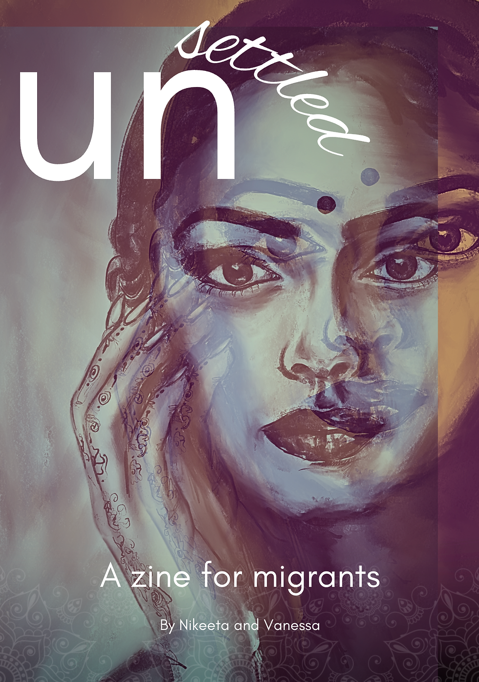

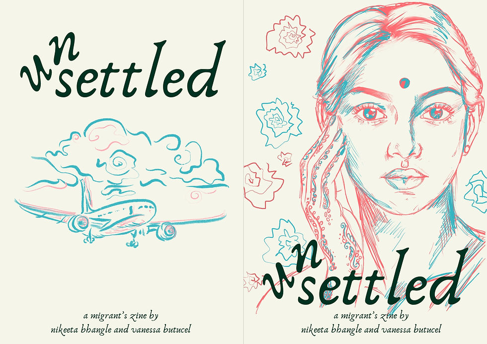
We choose to go for 'A Place We Never Knew' and 'Unsettled' in the end, as we felt they fit our zine and theme the most.
To represent 'A Place We Never Knew' for my version, I used a picture of my mom on her wedding day, when she was exactly my age now (21 years old). In the background are national symbols from my country (such as the pattern used in traditional clothing), an outline of Moldova, and a picture of our forests. These are a few things that remind me of this place, which is now a distant memory in my mind. This, along with a place I have never been to - my country when my parents were younger, which they never wanted to leave. Unfortunately I have never known my country as them at that age, so I used this picture to represent this, it being something that means a lot to me.
On the other side, my co-creative's version had a drawing of a woman in her cultural clothes, with an ambiguous look on her face. The intention was to draw a tear on her face, but we didn't end up going with that. My co-creative experimented with 3D effects and colourful overlays, and after she drew a line caricature, I experimented with the background we could use for it. I tired to go for waves, roads, clouds and the globe, but none of them seemed to work for it, especially because we needed a more muted background so the drawing stands out. We also tried different colours and fonts, as well as names such as 'In Motion'. For our Crits, we decided to also include mock ups of the spreads and covers, so we can show the viewers what the zine would look like, which I felt added a lot to our presentation. Moreover, we also included live backgrounds of waves, landscapes, roads etc to make the slideshow more engaging. The feedback received was very positive, and our viewers really liked the contrasting zines, which was unexpected but it made us think how we can incorporate two sides in the same zine.


After the Crits, we kept editing and working on the zine layout and brand images. When it came to the Exhibition, initially we had a plan to make a physical presentation, with a table in the middle, and handwritten letters that seem 'blown' away on one side versus neatly arranged on the other side (to represent the two sides of the coin). On the table we were going to have cultural heritage goods from some of the countries addressed in the letters and some more ink and paper. Our idea was so also display cultural objects such as national patters and photographs and make this corner 'feel like home' as seen on the right and below.
We gathered handwritten letters women wrote to their home countries, however we did not use them for this in the end. At some point, we had an idea to incorporate postcards on the wall or in the actual zine, but we decided to go with that for the exhibition, which we are still working on. Please see below some pictures for reference.
Moreover, another idea that appeared during the winter break was to manipulate light to present the project, but we decided to also leave this for a later date, and not overcomplicate the zine. We might, however, use this for the project at the exhibition but it needs a bit more development.


After having a meeting with our supervisor, we were guided into a better direction and were advised to work and present an actual excerpt of our zine. We worked on a settled mood board (please see right for images), and we were improving our colour palette. We then realised the existing colours do not fit our 3D glasses very well (which arrived later on), so we had to change the colours to fit the glasses as closely as possible, in order for the visual effect to happen.


Another idea, was making a reversible zine: a way to implement the crits feedback and to make the zine reflect two sides of the same story. However, this would be then too complicated, and we decided to go for the colour effects, which would be more interesting to edit and play with.
Another idea we had is to use tracing paper, at this point we had already been experimenting with it and have previously incorporated that in our Crits submission. The idea was to replace some of the pages with transparent tracing paper (like baking paper), which we still love as an idea, however we did not end up using on this occasion.
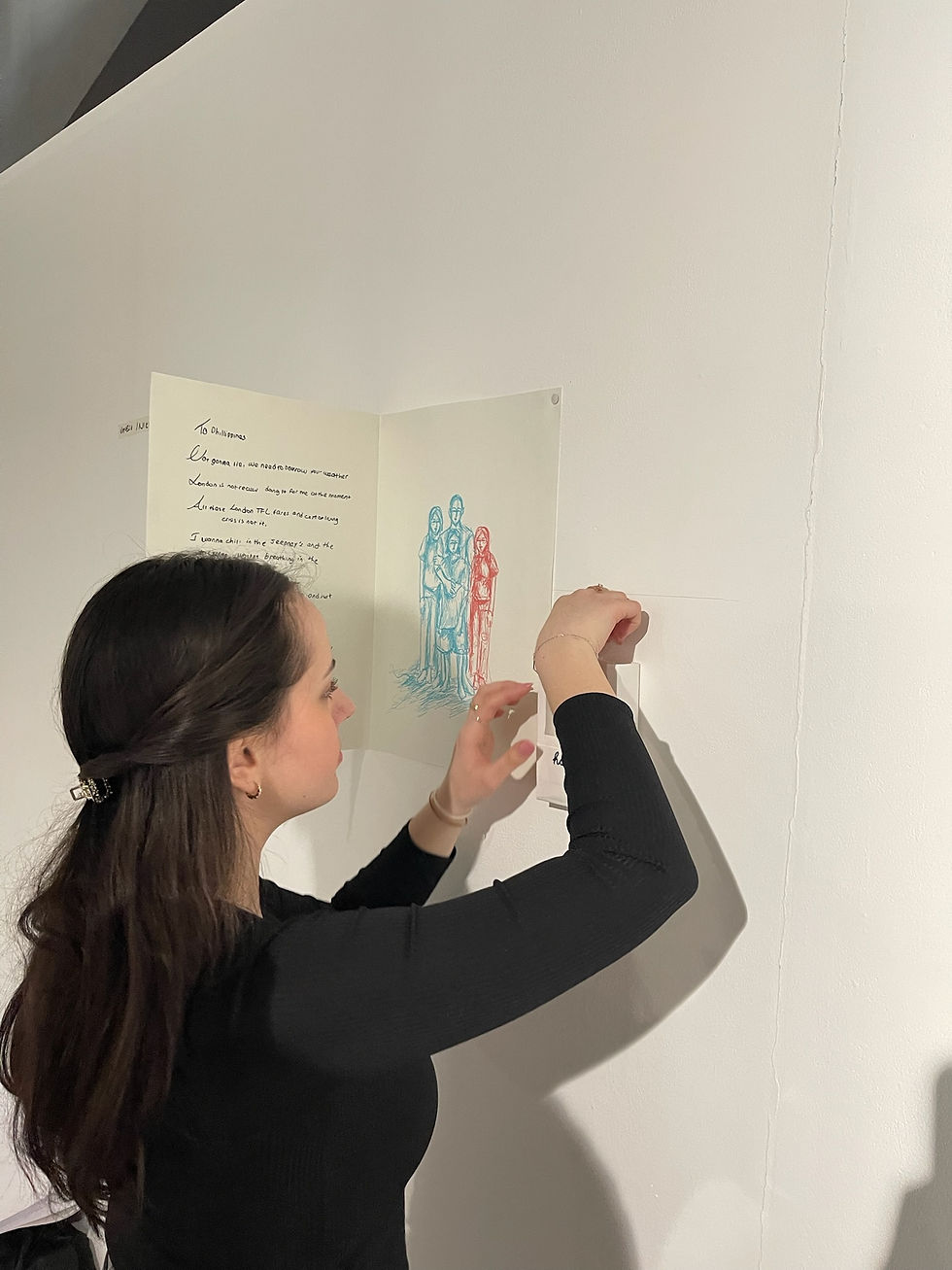
We then started editing our double page spreads, and while my co-creative was drawing the optical illusions in red and blue, I was deciding on the text that would be featured. We decided to use the letters written in the end, as some of them stuck with us so much that we wanted to incorporate them in the project, so I scanned them and used one to base our Exhibition on: Philippines.
I then worked on layout and art direction, making sure the pages looked good and the art/text was strategically placed.


When it came to the Exhibition, we made sure to print the papers one day in advance, so coming into university on Sunday proved useful, as I was not in a rush and took my time with printing using the right paper.
As always, the WI-FI and printing system was not the best, it had glitches, I had to wait a lot and I had to retry a few times, but in the end it worked out and I managed to print the same twice (just in case).
The work received good feedback from lecturers and viewers, everyone was inclined to use the glasses, which created a great illusion, making the harsh truth or hopes and dreams disappear with the right coloured glasses.
The progress after this was mostly based on editing the zine to perfection, deciding which pages to include, which pages we will not go for, and the order we would go for.
We also used the zine outline advised by our supervisor to print mini versions, seeing what they would look like in real life really helped elevate the project and improve last details.
My co-creative kept drawing the mesmerising visuals and I worked on the texts and poems, pushing myself out of my comfort zone.
The research done about female migrants also helped incorporate numbers into the zine, one idea was representing stats with text, which can be seen on the right. I used one of our academic texts to show the percentage of reasons women migrate to the UK.
Throughout this project, I have written a variety of poems, articles, interviews and have edited a variety of symbols and line drawings to fit the text, as seen on the right. I usually start by writing the copy in my notebook or laptop documents and then edit the text on the zine, conforming to the layout and brand image. Some of my copy did not end up making the zine, due to lack of space or quality, but it is still very important to me, as it shows proof of my progression throughout this project.


Researching different poems and authors really helped me write my own poems as well, which is a first for me, but very worth it. I pushed my boundaries during this project, and I am really proud of the work achieved so far.
I helped Nikeeta with the visuals a lot, and she did the same for me with the copy, and each of our work is very important and a combination between each of our skills and each other's help. I appreciate our team work and am very excited to execute our project in the exhibition.
Our ideas for the exhibition include projectors, waves, plinths and a lot of printing, so the next step for this project is more brainstorming, scamping, editing and of course, printing. Before starting we need to decide on what will fit our project, however as we want everything to be consistent with the brand image as advised by our supervisor. We are looking at displaying some double page spreads on walls and 3D glasses shelves, with plenty of them for viewers to try on. We also had the idea to use a projector on the walls/floor to display water and waves videos, making it seem like the room is 'unsettled', and evoking the main emotion from our zine, which is uncertainty. Below is a scamp of what our plan is for the exhibition, however we are certain things will improve in the process.


